Polishing for an e-book release is significantly easier than for a PDF print release. This is because the reading software or device on which your book is displayed for the reader reformats your book to fit correctly on a particular screen. Also, printed books have individual pages, while e-books do not. Your e-book’s contents are handled like a one-page website where you simply scroll from top to bottom. In some cases (for example, new chapters, title pages, or publisher pages), it makes sense to enforce a page break even in an e-book with \nextpage.
This is an excerpt from Better Books with LaTeX the Agile Way.
If you plan to release your book as an e-book as well as releasing a print version (which I recommend), you should first finish and release the e-book version and then work on polishing the print version. This is because there are additional steps required for the print version (like cleaning up empty pages and creating the index).
Preparing Images for E-books
Text can easily fit on any screen because it is very flexible, but images are not. They are not reinterpreted and adapted to a specific device; rather they are simply scaled to fit into the reader’s screen. Text does not lose quality when being adapted to a particular screen resolution, while image quality might suffer significantly.
For e-books, lossy JPG files are preferred because, on Amazon, distribution costs per book are not by page, but by the file size of the e-book for each download. Except for the cover graphic (which is uploaded separately), you should use low-resolution images (300 dpi) throughout your book as the device on which the image will be shown will most likely have a low resolution, too.
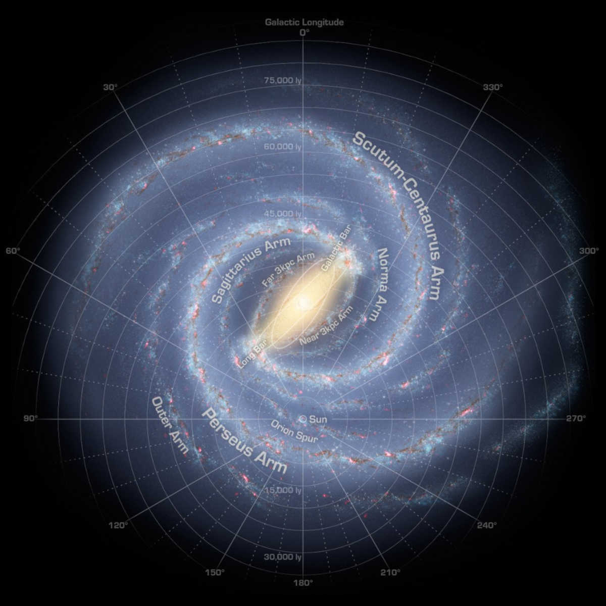
One major difference between e-books and printed books is that you can get color for free, at least on some devices. On other devices, all graphics are converted to grayscale versions. Here, it is up to you whether you want to provide an extra service for owners of more modern devices (or who read the book on a smartphone) or have print and electronic versions of your book identical when it comes to graphics. If you decide on grayscale images, you will save around a third of the file size. For example, this photo of the Milky Way has a size of 328 kb in color, but only 250 kb in grayscale (see Figure 19.1).

Another difference is scaling. For the print version, you can use \adjustbox{} to fit an image into the dimensions of a page. For the e-book version, images are scaled automatically to the width of the screen. While this saves you the work of scaling it yourself, you might end up with images larger than intended (and thus having a lower resolution) in those cases where you have scaled down the picture in the PDF version.
For all TikZ graphics, this is configured in the lib/inittikz.tex file: all TikZ graphics are automatically converted to PNG files with a fixed width (1,245 pixels by default). Instead of being scaled up, the transparent background of smaller graphics is simply extended.
For smaller, non-TikZ graphics that you include from external sources (e.g., JPG images), you should make sure that there is sufficient space left and right of the image. This ensures that they are not distorted during the e-book conversion process. Larger images for which you are already using the full width of the page in the print version do not have to be edited as they will be scaled down automatically. Alternatively, make it a rule for yourself to not use \adjustbox{} in the print version and instead do all the scaling manually by editing the image externally in a graphics editor. The benefit of this approach is that you do not need a separate e-book version of your images.
If you are using images with fonts, lines, or diagrams in them, make sure to be consistent and use the same font sizes and line thickness throughout your book. This can be a significant challenge if you do not have access to the original image files. For that reason, for any new images you want to add, I strongly recommend using vector graphics (or TikZ graphics) as the image source.


